Concept project
Accessible React Component Library
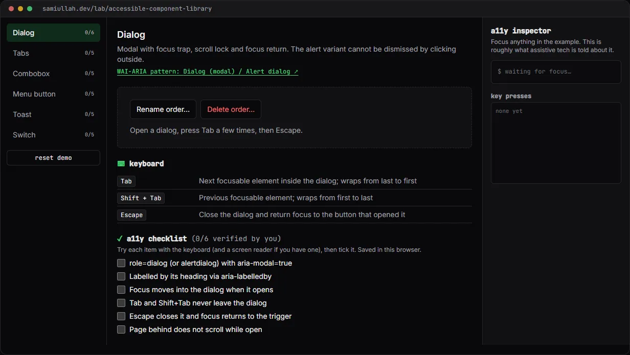
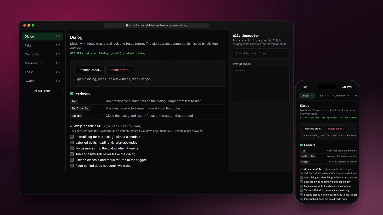
A concept project with a working demo: six React components built to the WAI-ARIA patterns (Dialog, Tabs, Combobox, Menu button, Toast and Switch), shown in a playground with a keyboard table per component, a manual test checklist, and a live inspector that shows the role, name and ARIA state of whatever has focus.
Overview#
Most accessibility bugs I see in React apps come from a handful of components: a modal that lets focus escape, tabs where every tab is in the Tab order, a custom dropdown that a screen reader announces as "group". They are hard to get right once and easy to get wrong again in every new feature.
This concept is a small library of those components, built to the WAI-ARIA Authoring Practices. The live demo is a playground: use each component, read its keyboard contract, and watch an inspector show what assistive technology is told.
My role#
Everything: the shared keyboard helpers, the six components, the docs data, the playground and this write-up. It is a concept project, not a published package. The examples use fictional data such as "Acme Dental" and "Order #1042".
The problem#
Accessible components are a contract, not a look. A Tabs component has to:
- put only the selected tab in the Tab order,
- move between tabs with arrow keys, wrapping at the ends and skipping disabled ones,
- link each tab to its panel with
aria-controlsandaria-labelledby.
Every component has a list like that, and most of the rules are invisible. You cannot see a missing aria-expanded. Teams also tend to re-implement the same arrow-key and focus logic in each component, with slightly different bugs each time.
So the goals were: shared helpers written once for the common behaviour; components that follow the written patterns; and a way to see the invisible parts.
Approach & architecture#
- a11y.ts (nextIndex, trapTab, typeahead, filterOptions)then
- Tabs, Menu, Dialog, Combobox
- components.tsxthen
- playground examplesthen
- focusin / keydown listenersthen
- inspector
- docs.ts (keys + checklist per component)then
- keyboard table + checklist
One function for arrow keys. Tabs (horizontal) and Menu (vertical) both need arrows, Home, End, wrapping and skipping disabled items. That is one pure function:
export function nextIndex(
  current: number,
  key: string,
  count: number,
  opts: { orientation?: "horizontal" | "vertical"; wrap?: boolean; disabled?: (i: number) => boolean } = {},
): number | null {
  const { orientation = "horizontal", wrap = true, disabled } = opts;
  if (count === 0) return null;
  const prev = orientation === "horizontal" ? "ArrowLeft" : "ArrowUp";
  const next = orientation === "horizontal" ? "ArrowRight" : "ArrowDown";
  // … Home/End jump to the ends, arrows step and wrap, disabled items are skipped
}
It returns null for keys it does not handle, so each component can fall through to its own keys (Escape, typeahead).
Roving focus vs active descendant. Tabs and Menu move real DOM focus between items, with only one item at tabIndex=0. The Combobox cannot do that: the user is still typing. Focus stays in the input and aria-activedescendant points at the highlighted option, which the screen reader announces as if it had focus.
Dialog focus management. On open the Dialog remembers the element that had focus, locks page scroll, and focuses the first control (or a data-autofocus element, which the alert variant uses for the safe "Keep order" button). Tab and Shift+Tab wrap inside it. On close, focus goes back to the trigger:
useEffect(() => {
  if (!open) return;
  returnTo.current = document.activeElement as HTMLElement | null;
  const overflow = document.body.style.overflow;
  document.body.style.overflow = "hidden";
  const root = panel.current!;
  const target = root.querySelector<HTMLElement>("[data-autofocus]") ?? focusables(root)[0] ?? root;
  target.focus();
  return () => {
    document.body.style.overflow = overflow;
    returnTo.current?.focus();
  };
}, [open]);
Making the invisible visible. The inspector listens for focusin and every key press inside the playground, then reads the focused element's role (explicit or implied by the tag), an approximate accessible name, and its ARIA attributes. Pressing ↓ on the Combobox shows aria-activedescendant change; opening the Menu shows aria-expanded=true.
Key challenges#
- Combobox clicks. Clicking an option blurs the input first, which closes the list before the click lands. Options call
preventDefault()onmousedown, so focus never leaves the input. - Announcing results. Typing in the Combobox updates a polite live region ("6 results available") so screen reader users know the list changed.
- Menu typeahead. Typing letters jumps to the next item starting with them. Keys within 500 ms build one search string, so "du" finds "Duplicate" rather than cycling through every "D".
- Toasts that do not steal focus. Info and success toasts use
role=status, errors userole=alertand stay until dismissed. Timers pause while the pointer or focus is in the notifications region, so nobody loses a message while reading it. - Reduced motion. The Switch thumb, the dialog fade and the toast slide use
motion-safeandmotion-reducevariants, so they are static when the user asks for less motion.
Tech stack#
- Demo: TypeScript, React 19 and Next.js. No UI or headless component library; every behaviour is in
a11y.tsandcomponents.tsx. Checklist progress is saved inlocalStorage. - Production design: the same components in their own package with
forwardRefand typed props, Storybook docs with the accessibility addon on every story, and Vitest with Testing Library for the keyboard tables.
Results#
- Six working components (Dialog and alert dialog, Tabs with automatic and manual activation, Combobox, Menu button, Toast, Switch), each with its keyboard table and test checklist.
- Shared helpers mean arrow-key, Home/End and disabled-item behaviour is written once and behaves the same in Tabs and Menu.
- The inspector shows the role, name and ARIA state of the focused element after every key press, which makes the patterns easy to check and to explain.
I have not run the components through a formal audit or with screen reader users. This is a concept build without real users, and the checklist is for visitors to verify the behaviour themselves.
Try the demo#
Open the component library demo. Things to try:
- Open Delete order… in the Dialog example. Focus lands on "Keep order". Press Tab several times, then Escape: focus returns to the button.
- In Combobox, type "pa", use ↓ and watch
aria-activedescendantchange in the inspector. - In Menu button, press Enter, then type "d" twice to move between "Duplicate" and "Download PDF". "Archive" is skipped because it is disabled.
- In Tabs, turn on manual activation and compare how arrow keys behave.
What I would do next#
- Write a Testing Library test for every row of every keyboard table and run them in CI.
- Package the components with per-component entry points and type declarations, and check that importing Switch alone does not bundle Dialog.
- Add Tooltip, RadioGroup and Disclosure, and a Listbox that the Combobox can reuse.
- Run each component with NVDA and VoiceOver and record the results in the docs.